ACCESSIBLE GAME DESIGN / SEPTEMBER 20, 2026
Drag, tap, or choose? Better puzzle controls give players a fair path.
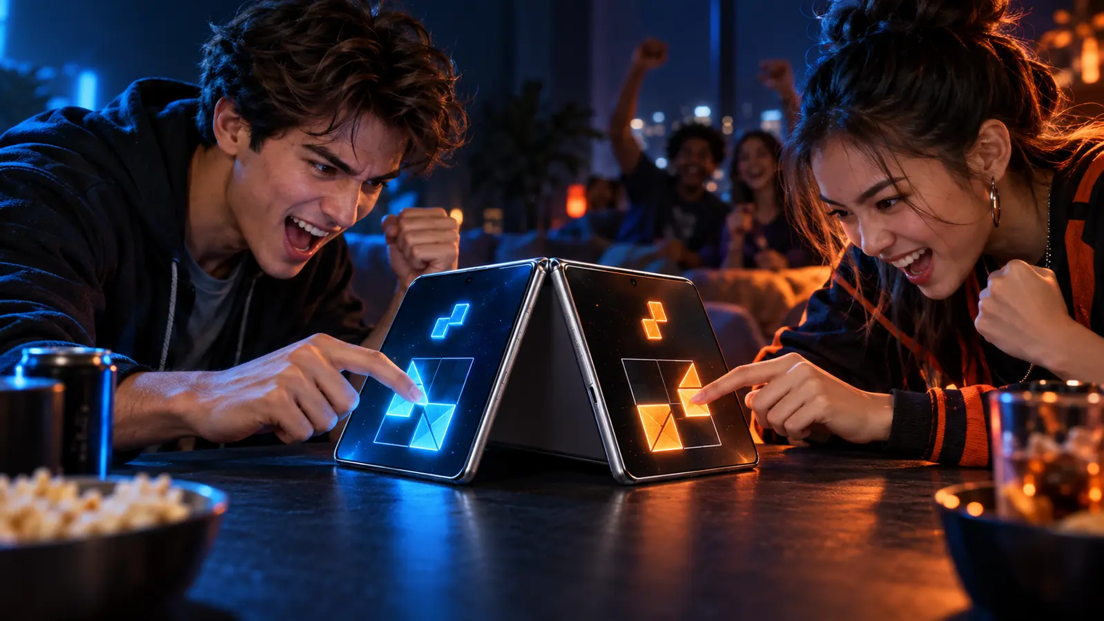
Dragging feels natural in a puzzle race. It should not be the only way to pick up, move, and place a piece.
By the DuoDragonz team · Published September 20, 2026
THE QUICK ANSWER
Should a mobile puzzle game use drag or tap-to-place?
Use both when the game can keep them competitively equivalent. Dragging is immediate and expressive, which makes it a strong default for a race. Tap-to-place turns the same action into discrete steps: select a piece, choose a destination, confirm the result. That can reduce the precision, reach, and sustained-contact demands of dragging.
The alternative is not a shortcut. Both control paths should use the same puzzle, legal placements, snap validation, timer, and completion rules. Playtesting then has to answer the hard question: does either input method create a meaningful competitive advantage?
Control options at a glance
| Input path | Strength | Potential barrier | Design response |
|---|---|---|---|
| Drag and drop | Direct, physical, and fast | Holding, tracing, and precise release can be difficult | Large pickup zones, forgiving snap areas, clear grabbed state |
| Tap-to-place | Less continuous movement and easier correction | Needs a clear selected piece and destination flow | Visible focus, simple undo, same placement rules as drag |
| Assistive technology | Can turn a spatial action into named, discrete steps | A visual canvas may have poor labels or focus order | Concise labels, logical order, custom actions, complete task testing |
Why drag-only design can exclude players
A drag gesture quietly combines several jobs. The player must find a small object, touch it accurately, keep contact while moving, avoid blocking the destination with a finger, and release within the accepted area. Speed pressure makes every step harder. Tremor, limited reach, reduced dexterity, a temporary hand injury, screen glare, or simply a crowded layout can turn the control, not the puzzle, into the real opponent.
That does not make dragging bad. It means the interaction needs forgiveness: a pickup zone larger than the artwork, obvious feedback when a piece is grabbed, a destination that remains visible under the player’s finger, magnetic assistance near a valid target, and a harmless recovery when the release is wrong.
What tap-to-place should feel like
- Select a piece. The selected state uses shape, outline, movement, or text, not color alone.
- Choose a destination. Valid targets are reachable in a logical order and remain readable at a glance.
- Confirm or undo. Correct placement uses clear visual, audio, and haptic feedback; an accidental selection is easy to cancel.
- Keep the rules identical. The alternative control cannot loosen the solution or bypass rotation and orientation requirements.
For a timed game, tap-to-place may be faster in one situation and slower in another. The only honest way to balance it is with representative playtesting. If a persistent advantage appears, separate control-method leaderboards or non-ranked accessible modes may be fairer than pretending the difference does not exist.
Apple’s guidance, translated into a puzzle board
Apple’s current VoiceOver evaluation criteria says that when a person can tap, click, or drag something visually, developers should strive to make the action work with VoiceOver too. Apple also says users should be able to complete the app’s common tasks with VoiceOver alone, with concise labels and accurate control state.
Apple’s Voice Control criteria applies the same principle to voice-only use. Tappable elements need usable names, visible labels should match spoken names, and complex gestures need a speech-operable equivalent such as an accessible custom action. On a puzzle board, “Blue triangle, unplaced” is useful; “piece” is not.
These are design requirements to test, not certifications we can claim in advance. Puzzle pieces need a predictable focus order, a clear selected/unselected state, named destinations, actions for move, rotate, flip, place, and cancel where applicable, plus an announcement when a piece locks or the round ends.
Do not use blue versus orange as the whole instruction
The DuoDragonz identity uses two strong player colors, but player state cannot depend on hue alone. Apple’s Differentiate Without Color Alone criteria recommends adding text, icons, shape, placement, or other visual differences. Player sides can keep their brand colors while also using distinct dragon marks, piece outlines, labels, and result symbols.
A simple test is to play in grayscale. If a player can no longer tell whose timer, score, selected piece, or victory state is whose, the design needs another signal.
Audio, haptics, and motion should confirm, not compete
A snap can combine a short sound, haptic, and visible lock state. That redundancy helps in a loud room, with the device muted, or when a player misses one type of feedback. Shared audio also needs care: neither side should gain an informational advantage because one player is closer to a speaker.
Winner reveals can stay exciting without forcing spinning, scaling, parallax, or continuous effects. Apple’s Reduced Motion criteria recommends changing or disabling motion triggers when a player’s setting indicates that preference. A reduced-motion reveal can replace a camera rush or vortex with a crisp score change, static winner banner, sound, and optional haptic.
Our planned Puzzle Rush control test
Puzzle Rush is still in development. This is the test plan, not a claim about a released feature:
- Prototype drag and tap-to-place against the same four-piece puzzle.
- Keep placement validation, snap tolerance, timer, and completion rules identical.
- Measure completion rate, median finish time, incorrect actions, and rematch choice.
- Test with VoiceOver, Voice Control, Reduce Motion, grayscale, larger interface text, and real device orientations.
- Include players with different ages, hand sizes, motor abilities, game experience, and familiarity with assistive technology.
- Record whether either control creates a repeatable speed advantage before ranked competition is considered.
Apple now lets developers publish Accessibility Nutrition Labels and an accessibility information URL through App Store Connect. Apple requires developers to evaluate support against its criteria; we will not list a capability merely because the design intends to support it. See Apple’s Accessibility Nutrition Label guidance.
For the match-level layer above individual controls, use our visual, sound, and haptic cue audit to check countdowns, input confirmation, errors, score changes, results, silent play, and both player seats.
The design rule we are carrying forward
Competitive accessibility is not “make everything easier.” It is: preserve the challenge, remove unnecessary input barriers, and measure fairness instead of assuming it. The puzzle should decide the race, not who can hold a finger perfectly still.
Continue with our multiplayer-mode comparison, read the iPhone Duo games guide, or follow Puzzle Rush playtest and launch updates.